Purple is one of the most captivating colors in the spectrum, often associated with royalty, mystery, and creativity. If you’re asking, “What colors make purple?” the answer lies in a combination of primary colors, with red and blue being the main ingredients. Understanding how different hues and tones interact can open up a world of possibilities for artists, designers, and anyone interested in color theory. In this article, we’ll explore how to create purple, what influences its shades, and how to perfect the mix for various artistic applications.
The Basics of Purple: Mixing Red and Blue
At its most basic level, purple is created by mixing red and blue, two of the three primary colors in the RGB and traditional color wheels. By combining these hues in different ratios, various shades of purple can be achieved.
The Color Wheel and Primary Colors
Before diving into the creation of purple, it’s helpful to understand the color wheel. The traditional color wheel consists of three primary colors: red, blue, and yellow. These colors cannot be created by mixing others. When red and blue are combined, they form the secondary color purple. The process of mixing colors can be more complex depending on the desired result, but the foundation of purple is rooted in this simple combination.
Factors That Affect the Shade of Purple
When mixing colors to create purple, several factors influence the resulting shade. These include the specific tones of red and blue used, the medium (paint, digital, etc.), and the amount of each color in the mixture.
Warm vs. Cool Tones
A significant factor in determining the exact shade of purple is whether you use warm or cool tones of red and blue.
- Warm Reds and Cool Blues: A warm red, like crimson or scarlet, mixed with a cool blue, like cobalt or ultramarine, will create a vibrant, rich purple. This shade is often associated with luxury and royalty due to its intensity and depth.
- Cool Reds and Warm Blues: If you mix a cool red, such as magenta, with a warmer blue like cerulean, the resulting purple may be softer and more muted. This type of purple can be ideal for creating pastel tones or cooler, softer hues.
Amount of Each Color
The ratio of red to blue in the mixture significantly affects the resulting shade of purple. For example:
- More Red: Adding more red will create a reddish-purple or magenta-like shade. These tones can appear warmer and more vibrant, depending on the level of red used.
- More Blue: A higher amount of blue will shift the purple towards a cooler, bluish tone, resulting in colors like indigo or violet. These shades are often perceived as calming and deep.
Tint, Tone, and Shade
In addition to the base colors, you can adjust the purple by adding white, black, or gray to change its intensity and mood.
- Tints: Adding white lightens the purple, creating soft pastel purples or lavender.
- Shades: Incorporating black into the mix will darken the purple, producing deep, rich hues like eggplant or plum.
- Tones: Introducing gray results in muted or subdued purples, which can be useful for more sophisticated or subdued palettes.
How to Achieve Vibrant Purples in Paint
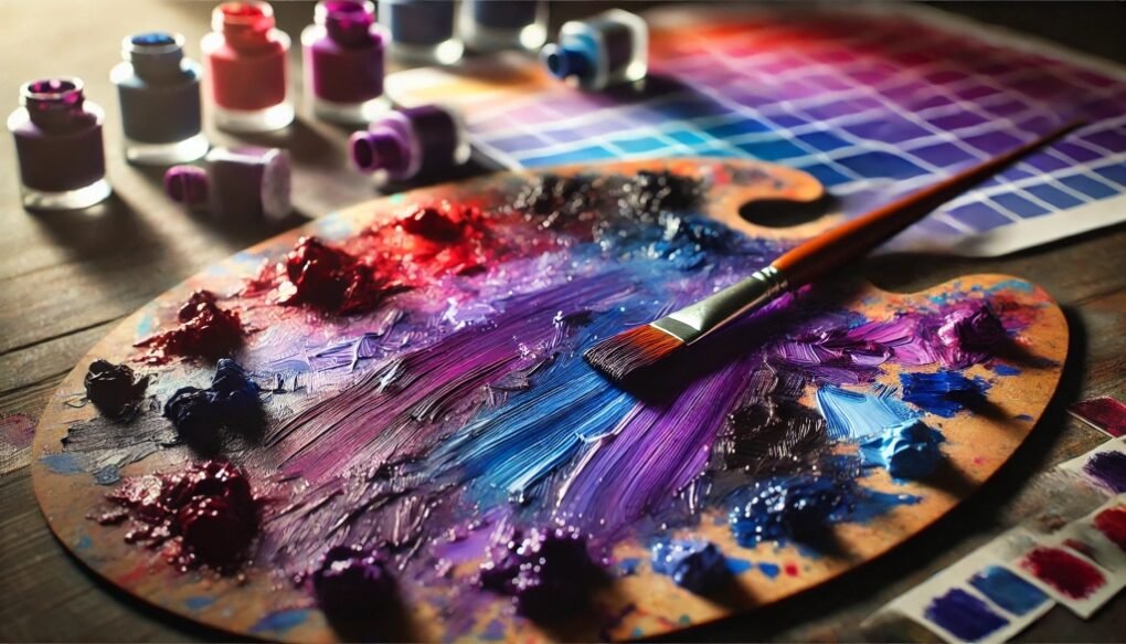
Mixing purples with paint requires an understanding of pigments and how they interact. Many beginners make the mistake of using red and blue paints that contain impurities, resulting in muddy or muted purples. To get the best result, follow these tips:
Use Pure Pigments
Start with pure, unmixed red and blue pigments. Cadmium red, for example, contains yellow, which can dull the purple. For the most vibrant purples, use paints like alizarin crimson (a cool red) and ultramarine blue (a warm blue). These pigments will yield a clear and bright purple when mixed.
Avoid Complementary Colors
Complementary colors sit opposite each other on the color wheel. In this case, yellow is the complement of purple. Introducing even small amounts of yellow or other warm-toned impurities can turn the purple brown or muddy. If you want a vibrant, clean purple, ensure that your red and blue are free of yellow undertones.
Digital Art: Creating Purple with Light
In the digital world, color is created through light using the RGB color model, where red, green, and blue are the primary colors. When mixing colors digitally, the process of creating purple is slightly different but follows the same principles.
Adjusting RGB Values
To create purple in a digital medium, you’ll adjust the RGB values. Pure purple in the RGB model has equal amounts of red and blue and no green. The standard RGB values for purple are R:128, G:0, B:128.
- More Red: Increasing the red value will shift the color toward magenta.
- More Blue: Raising the blue level will move the color toward violet.
Digital tools make it easy to experiment with various purples by adjusting these values precisely, allowing for a wide range of custom shades.
Purple in Design: Emotional and Psychological Impacts
In design, purple carries strong emotional and psychological connotations. This color is often associated with luxury, creativity, spirituality, and mystery. Different shades of purple can evoke various feelings and moods.
Light Purples
Shades like lavender and lilac are often used to convey calm, femininity, and romance. These colors are common in branding for beauty and wellness industries because they are gentle and soothing.
Dark Purples
Deeper purples, such as plum or eggplant, suggest sophistication, power, and mystery. Brands that want to communicate luxury or exclusivity often incorporate darker purples into their color schemes.
Purple in Nature
While purple isn’t as common in nature as green or blue, it still appears in stunning forms, especially in flowers like lavender, violets, and lilacs. These natural purples can range from soft pastels to rich, vibrant hues, often inspiring artists and designers in their color choices.
Common Mistakes When Mixing Purple
Creating the perfect shade of purple is an art, but it’s easy to make mistakes that result in dull or muddy colors. Here are a few common pitfalls:
Using the Wrong Shades of Red and Blue
Not all reds and blues mix well together. For instance, mixing warm reds that contain yellow, like cadmium red, with a cool blue like phthalo blue, will likely result in a brownish purple. Always choose reds and blues that are free from yellow and green undertones.
Overmixing
Overmixing colors can cause them to lose their vibrancy. When creating purple, aim to mix just enough to combine the colors without blending them into a flat, muted hue. A few strokes of the brush may be all that’s needed.
Adding Yellow or Green by Mistake
Even a small amount of yellow or green can drastically change the color of purple, turning it into a muddy or brownish shade. Make sure your palette and brushes are clean to avoid accidentally introducing these colors.
Perfecting Your Purple
Answering the question, “What colors make purple?” boils down to understanding the relationship between red and blue, and how various factors such as tone, medium, and mixing methods influence the final color. Whether you’re mixing paint or working in digital mediums, experimenting with different shades of red and blue can open up a world of beautiful purples. Be mindful of color theory principles, avoid common mixing mistakes, and soon you’ll master the art of creating the perfect purple for any project.